Loading...
2D转换转换是CSS3中具有颠覆性的特征之一,可以实现元素的位移、旋转、变形、缩放,甚至支持矩阵方式,配...
最近有重新读了一遍《巴黎圣母院》。这本书给我留下了深刻的印象,使我受益匪浅,原因是:它让我看到了世间最深...
渐变是CSS3当中比较丰富多彩的一个特性,通过渐变我们可以实现许多炫丽的效果,有效的减少图片的使用数量,...
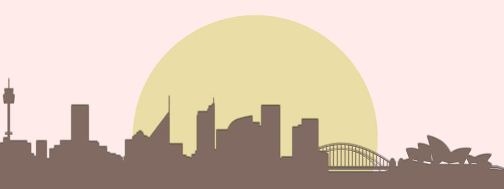
效果图:示例代码:<!DOCTYPE html> <html lang="e...
边框圆角border-radius每个角可以设置两个值 ,x 值,y值。边框阴影box-shadow ...